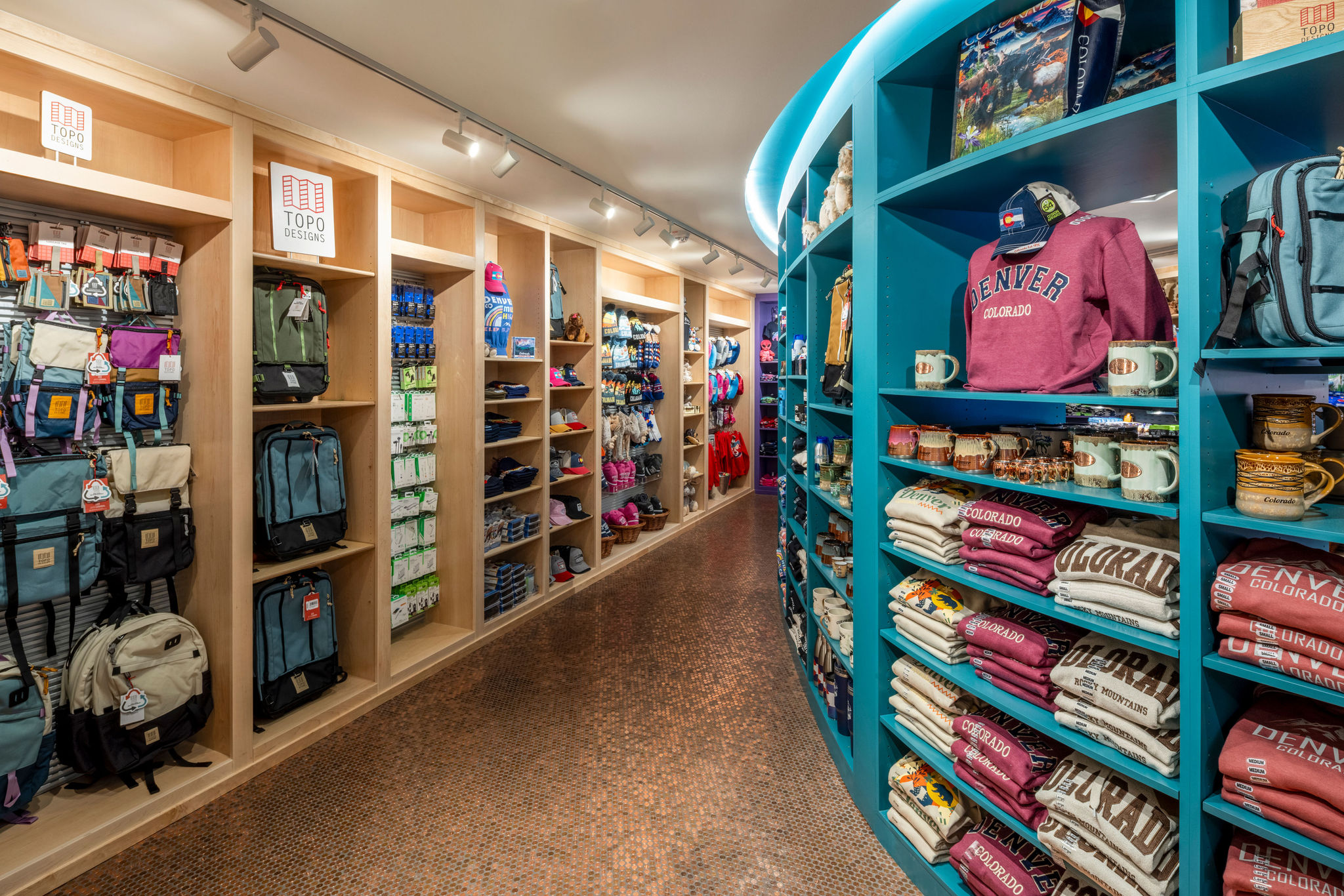
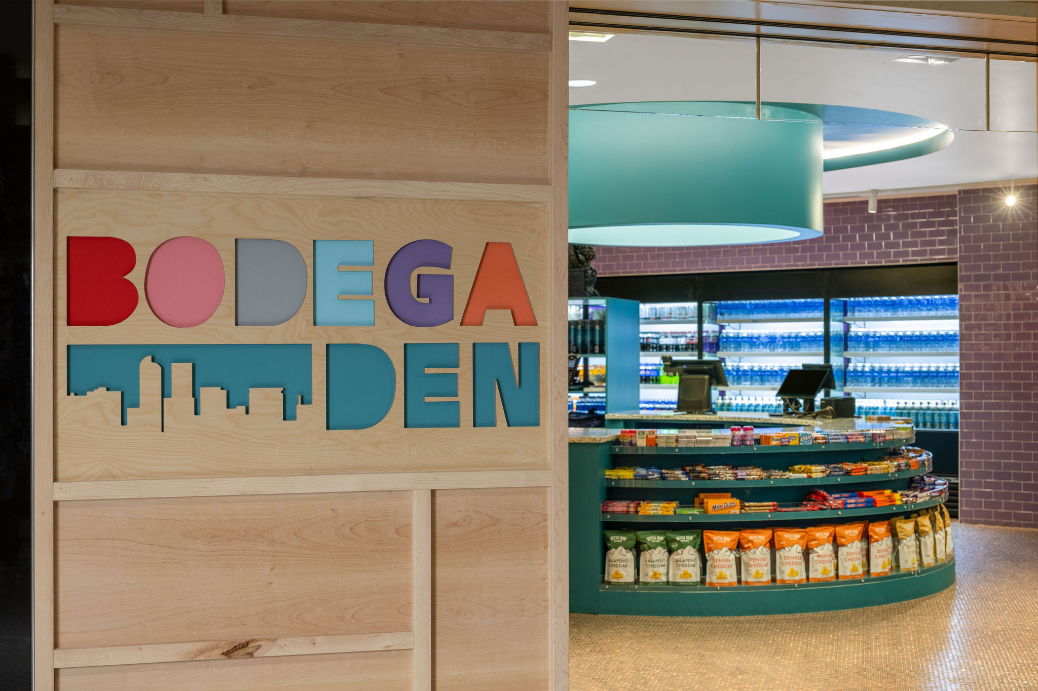
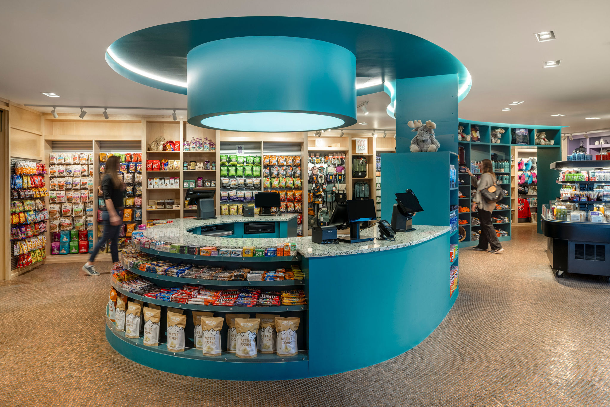
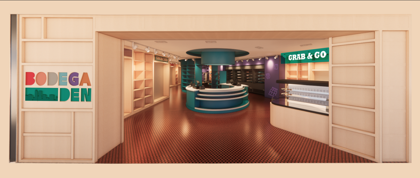
Bodega DEN reimagines the corner store with a bold, playful spirit, channeling the charm of a New York bodega into the fast-paced setting of Denver International Airport. The design takes a familiar typology and transforms it into something vibrant, fluid, and unexpectedly delightful, disrupting the otherwise mundane experience of grabbing a quick snack between flights. Perimeter walls are wrapped in custom plywood shelving, a warm, utilitarian nod to the no-frills efficiency of classic bodegas. These built-ins not only provide function and familiarity, but also establish a rhythmic frame that grounds the rest of the space. At its heart, a sculptural, curving central spine winds through the store, breaking away from the conventional retail aisle. This flowing centerpiece echoes the movement of travelers in transit, guiding them intuitively while creating moments of curiosity and pause. Overhead, continuous cove lighting traces the form of the spine, accentuating its curves and softening the visual field. Instead of a flat, fluorescent environment, the lighting strategy introduces warmth, contrast, and movement, bringing a sense of calm to a typically rushed setting. A circular lighting element above the checkout, paired with a wash of light blue, evokes a hint of daylight, a rare comfort in airport retail. The spine becomes more than display shelving; it’s a spatial gesture, carving out pathways, directing the eye, and encouraging a more human experience at the terminal’s core. Color plays a defining role in the identity of Bodega DEN. Drawing inspiration from the graphic logo, the palette bursts with bold hits of red, pink, orange, sky blue, purple, and teal —a youthful spectrum that celebrates diversity and expression. These hues appear throughout the space, both in branding and finishes, weaving a cohesive language of joy and energy. A stylized cutout of the Denver skyline grounds the concept in place, making the store not just another airport stop but a recognizable piece of the city’s identity. At the storefront, a Grab & Go station offers ultimate convenience with pre-packaged snacks, drinks, and intuitive self-checkout, perfect for those with only a moment to spare. For travelers with time to linger, the store unfolds as a layered experience: familiar yet fresh, fast yet thoughtfully designed. The penny-tile floor becomes a playful surprise, sparking delight across generations and inviting a closer look at an often-overlooked detail. More than a retail stop, Bodega DEN is a spatial invitation to slow down, look around, and engage, even in the fleeting in-between moments of travel. Through its thoughtful forms, vibrant palette, and subtle nostalgia, the design brings personality back to a space that is often defined by anonymity. It is, ultimately, a love letter to the bodega — reinterpreted for movement, memory, and ease.